20 years ago, Kevin Duffey suggested that mobile devices could double up as retail outlets. This gave birth to the term “mobile commerce”, and the concept of shopping via smartphones. At the time, it was almost outlandish to think that one day we would be able to explore and buy products via a pocket-sized gadget. However, the concept has swung into action and taken the world by storm!
It is no secret that today’s consumers prefer (read: love) shopping on their phones. It is not only convenient but also great from a business point of view. Statistics suggest that while the traffic from desktop devices has gone down drastically, mobile web traffic has gone up by approximately 30% in the last two years alone.
It is time for you to take a good look at your existing eCommerce website and app to gauge whether you are living up to customer expectations (and exceeding them). If you find that your website does not, well, here is your guide to optimize your eCommerce site so you can deliver a remarkable customer experience on mobile devices.
12 Pro Tips to Deliver an Exceptional User Experience on Mobiles
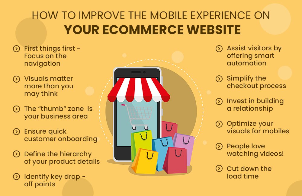
- First things first – Focus on the navigation
The journey of the userbegins on the home screen of your mobile website or application. Avoid overwhelming them with too much clutter here. While it may feel like you should throw ALL the important aspects of your site onto the navigation bar, resist the temptation to do this. Keep your app fairly easy to navigate – that will be a good note to start on. - Visuals matter more than you may think
Thinking out of the box is good, but sometimes it leads to really complex and over-the-top visuals. Remember, it is very important that your design is clean and easy on the eye. Text forms an integral part of your site, so make sure that it is legible and evenly spaced out. - The “thumb” zone is your business area
Design key interactions on your website or application so that they fall within or around the thumb-friendly zone on a mobile screen. Far too many businesses have made a mess of their app by not focusing on this all-important aspect. - Ensure quick customer onboarding
When people are visiting your website, make sure you welcome them and make the process of bringing them onboard as quick and hassle-free as possible. Avoid including too many steps at the start and keep the number of fields in necessary formsto a bare minimum. - Define the hierarchy of your product details
It is important to maintain a certain consistency in terms of the way your products appear on the screen of mobiles. Whether it is the individual product pages or the carousels that you present on different pages, make sure you display the product details in a uniform, well-structured manner. - Identify key drop-off points
Use analytics tools to detect points where a majority of your visitors are dropping off. Try and find out what you can change, remove or add, in order to make these points or sections more user friendly. - Assist visitors by offering smart automation
Provide your visitors with intelligent auto suggestions, auto detection, address lookup and error assistance throughout their browsing journey. This will not only speed up the buying process, but also reduce the amount of manual effort required to complete it. - Simplify the checkout process
Once your visitor has their heart set on making a purchase, it is essential that theyare able to complete this process in the shortest time possible. In many cases, the checkout process may be time consuming.This will cause your customers to experience discontent. Make this step easy, quick and secure to win the hearts and trust of your customers. - Invest in building a relationship
Integrate your key social profiles, offer discounts, and allow your customers to enable push notifications and sign up to your email newsletters. - Optimize your visuals for mobiles
Humans process visual information 60,000 times quicker than text, so it is vital that you take a visuals-driven approach to your mobile eCommerce site. Make certain that all your images are of the highest possible quality and sharp enough that customers can zoom them if they want to. It is best to offer your visitors an option to superzoom images. Ideally,you should also incorporate icons that suggest that customers can zoom in or pinch the images they see. - People love watching videos!
It is the era of videos. Incorporate product videos that are crisp and explain the key features and benefits of the products in a creative manner. And while you are at it, make sure to maintain simplicity in the visuals and digestibility in terms of the length of the video. - Cut down the load time
According to Kissmetrics, visitors will not wait over 8 seconds (on average) for your site to load. In fact, studies suggest that 73% of people encounter websites that they think are too slow in terms of page load time. Most cases of cart abandonment happen when the checkout page doesnot load instantly. Aim for a page load time of 3 seconds and you will notice a huge difference in the number of sales on your websites and mobile apps over a period of time.
The most successful apps are the ones that stay true to all of the above pointers. Here is a quick roundup of popular mobile shopping apps in the United States:
• Etsy
• Ann Taylor
• Amazon
• eBay
• Walmart
• Macy’s
Remember, when it comes to m-commerce, speed and user-friendliness are everything. While it is great to get creative, think out of the box, offer a breath of fresh air and break the clutter.Follow this golden rule to ensure that you deliver an exceptional mobile experience to your customers:
Do not think awesome, think user friendly.
And that is exactly what QualDev helps its clients achieve. Explore our array of eCommerce web and mobile development services.