eCommerce website design is not just about building a website to sell products, but also about designing a pleasant online shopping experience. Several factors together determine the overall success of an eCommerce website. These including product quality, brand label recognition, shipping expenses, return policies, reliability, customer service, and of course the two most important aspects – website design and development. Because of the razor-thin profit margins, ecommerce website design companies cannot afford to make flawed design choices.
“We don’t just sell websites; we create websites that SELL.”
― Dr. Christopher Dayagdag
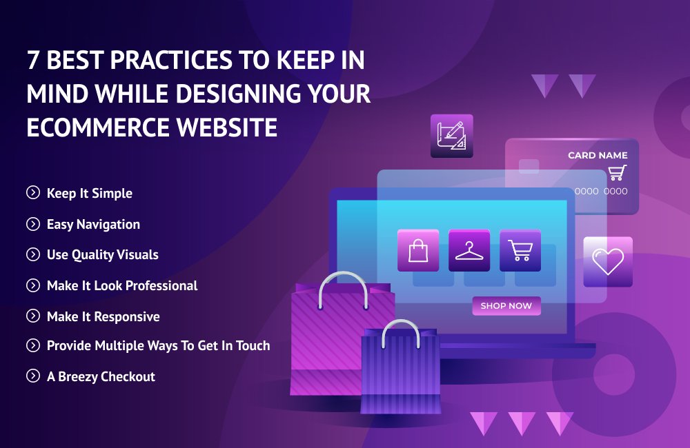
Here are seven proven best practices for website design that we at QualDev swear by and that you should know about –
1. Keep it simple
They say, “If you think math is hard, try web design!”
An important rule to remember while designing your eCommerce website is to stick to simplicity and aim to create to appeal to a broader audience. A minimalistic approach helps the website and favors the products. Everything on the website should have a purpose, with nothing distracting the user from focusing on content.
If the design is complicated, there is a good chance that the visitor will not understand or appreciate it. Websites that have fewer colors per page, pure hues and simple and readable fonts are the ones that sell. This ensures the buyer sees the woods behind the trees, and the most helpful information does not get lost behind flashy design.
2. Easy navigation
If it were not for convenience, people would have never shifted to online shopping. The process of buying from website should be rational and free-flowing from one point to another so that the process feels natural – akin to muscle memory. If a visitor to your website needs to click ten diverse menus to get what they are looking for, they will most likely flee within the first few seconds.
User experience can be simplified by keeping the following in mind –
- The brand logo should bring the visitor back to the homepage
- Hamburger menu bar allow visitors to choose the correct category
- Filters help narrow down search results
- An easy to locate search bar shortens the buying
journey
3. Use quality visuals
The better the quality of graphics and visuals on your website, the more the users will favor your online store. This could include the following (with easy zoom-in zoom-out capabilities) –
- High-resolution photos (preferably creative photography)
- 360-degree views of your products
- 3D models or renders to show minute details
- Short and engaging videos
A huge reason visitors abandoning category and product pages, is because the owners of the website have failed to create visually appealing landing pages.
4. Make it look professional
Imagine giving your sensitive information, like your credit card number, to a website that does not look professional. This is how a customer would feel as well. Building trust is crucial if you want your ecommerce website to succeed and thus instill a professionalism and credibility. This means it is essential that your site content has –
- No typos or misspellings
- Consistent font, color palette, and footer design from page to page
- Fully functional product links and CTA buttons
If you want your shoppers to take you seriously, you need to show them that you are serious about your business. The only way to do that is with a professionally designed website and app.
5. Make it responsive
A recent report states that mobile has surpassed desktop devices as the most favored method to surf the internet. 79% of smartphone users buy products online using their mobile devices. So, if an ecommerce website is not engineered with a mobile-first approach, it is going to fail miserably. If you wish to grab new buyers who enjoy shopping on their phones or tablets, ensuring that your website design is fully responsive is important.
6. Provide multiple ways to get in touch
Your patrons are likely to hit the “Order” button faster if they know how to get in touch with you when they face any issues during their shopping journey. Having the following items on your contact page would undoubtedly help –
- E-mail, phone number, chatbot for instant contact
- Store location
- Social media profile links
- FAQs page for any contemplated queries
7. A breezy checkout
Remember how we said nothing kills a sale faster than complicated product pages. Well, a clunky checkout is the second reason. You are bound to lose customers if your checkout process is long and complex. If you want people to buy from your website, you must make buying as concise and hassle-free as possible. Make sure the steps on the checkout from your website are –
- Clean, simple, and easy to navigate
- Give the option to check out as a guest user or register an account
- The navigation and check out process should be crystal clear and
easy to understand - Offer different shipping options
- Provide a list of things to do in case of any problems
- Offer return or refund options
Once the purchase is completed, direct your consumers to a confirmation page so they know everything went through successfully.
The proverb “never judge a book by its cover” does not apply to ecommerce websites because there is a high chance that if your design fails to make a tremendous first impression, visitors are more likely to bounce. Enforce the tips outlined above and create a high-converting ecommerce website design that brings in more conversions!
Designing an ecommerce website can be a thorny task, but QualDev has you covered. QualDev is a web development company in New York known for building clean, customized eCommerce website designs that create lasting impressions both visually and interactively. So, what are you waiting for? Get in touch with us today!